RichardMEL
Enthusiast
- Joined
- Mar 28, 2014
- Posts
- 10,076
- Qantas
- Platinum 1
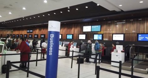
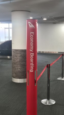
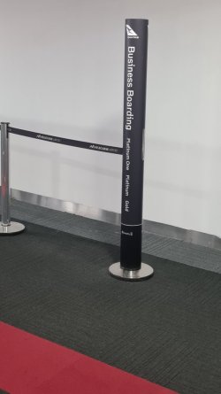
I noticed this week at MEL new slimline signage in place - I took some snaps on my return at a gate of the boarding area signs, but I saw the same kinds of signage at check in areas (inc international).
Gone are the big chunky signs (I saw them still in SYD yesterday) and now jut these thin columns with the same grey or red colour scheme, but the appropriate wording down vertically rather than horizontal. Notice also the VERY SMALL oneworld priority at the bottom for the priority line.
I am not a fan to be honest. I think this is easy to miss and for those not used to it not terribly helpful - doubly so at check in. It actually took me a while to find the J check in line! OK that may just be me, but I think, while these may be far lighter and easier for staff to manage etc than the big ones, it's not the most customer friendly design change.
Comments welcome
Gone are the big chunky signs (I saw them still in SYD yesterday) and now jut these thin columns with the same grey or red colour scheme, but the appropriate wording down vertically rather than horizontal. Notice also the VERY SMALL oneworld priority at the bottom for the priority line.
I am not a fan to be honest. I think this is easy to miss and for those not used to it not terribly helpful - doubly so at check in. It actually took me a while to find the J check in line! OK that may just be me, but I think, while these may be far lighter and easier for staff to manage etc than the big ones, it's not the most customer friendly design change.


Comments welcome


