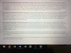
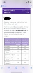
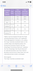
I signed up to Accelerate last year and also received the multiple bewildering emails. The Accelerate portal is straight out of the 90's with horrid UX. I believe its a vanilla corporate/TA portal add-on from Sabre that VA have whitelabelled and bolted a stylesheet onto.
Once you actually figure out you are assigned 3 different login levels (Admin, Arranger, Traveller) it starts to make more sense however the onboarding is really rough/non-existant and the flight booking flow is unintuitive. Like others have said it really doesn't provide a good first impression.
First step would be to at least restyle the existing elements like what the VFF site has just gone through. At least that would be a simpler solution in the interim requiring less effort than a complete overhaul.
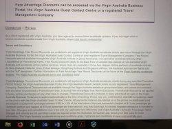
Here's a taste of the interface:


