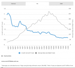
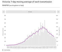
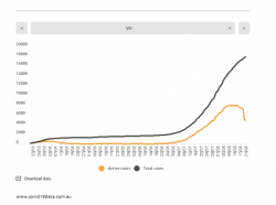
Interesting how over several situations, (VIC, Tas) after a spike, and then a hard lock-down, the # new cases seem to decline gradually rather than dramatically. In the graph in post 6822, the grey curve decline has virtually the same shape as the upslope, maybe a bit steeper, but not greatly so.
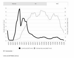
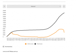
The rise reflects relatively unmanaged transmission, but the fall, in theory, shouldn't be the same shape as its being managed. For instance, if the lockdown was perfect, it would be a very steep falling away of the curve (EDIT: after the lag of the incubation period of pre-lockdown infections). Degrees of less-than-perfection will lessen the steepness. So I find it interesting (in an academic sort of way) that the present decline in Vic is almost symmetrical with the increase. Here's the equivalent NSW data, showing the same phenomenon without a hard lock-down. There are far fewer cases, so the conclusions are questionable.

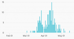
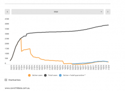
The NW Tas situation doesn't have enough data points to give a meaningful curve, I think, but may indicate a steeper decline side of the curve (thus arguing against my initial observation). This is raw data, not averages as above.

Don't worry, this
isn't a criticism or comment on the effectiveness of the Vic lock down (its more a theoretical observation) and I know there are multiple factors that will influence the shape of the curve, including test rates, testing spread, delays in reporting etc etc. But those should be largely similar for the upslope as well as the downslope, or perhaps less of a factor in the downslope time frame, in an emergency situation.
Do our medicos say,
@drron ,
@Princess Fiona have any insight into studies or theories on the shapes of infection curves where hard lockdowns have been applied? Should I stick to my day job?


