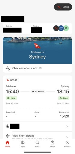
Qantas app refresh (new look)

Couple things here:
  1. It is recommended that you add your boarding pass to your Apple Wallet as soon as possible so that even if the QF app goes poopy in its trousers you'll still have a boarding pass to scan
  2. It is recommended that you get a paper boarding pass that you keep with you in case your phone goes poopy in its trousers as you'll still have a boarding pass to scan
  3. It is recommended that you have a physical QFF card that you keep with you which you can use to check in and board your flight irrespective of boarding pass
Given that Android has currently a larger marketshare than Apple, having only APple Wallet available is a major oversight from QF. My solution is to be a card-carrying member and flash that at the gate if the app stops cooperating.
 
Given that Android has currently a larger marketshare than Apple, having only APple Wallet available is a major oversight from QF. My solution is to be a card-carrying member and flash that at the gate if the app stops cooperating.

This has been a short coming for too long, especially since the Jetstar app has supported saving boarding pass to Google wallet for well over 5 years. It is such an easy function to implement, Ticketmaster, Ticketek and other ticketing/airline apps do it easily.

As a back-up, check-in via website and print BP to pdf, then you have copy on device that can't disappear.
 
Last edited:
incidently the rollout did finally make it to my droid last week.

I've not used it in anger as I'm not flying for a few weeks, but the home screen doesn't appeal and looks so "busy" - it was so much simpler to show the next flight/trip front and centre. Now, it's down and without helpful flight info until you open it up.

I have the impression that this doesn't *appear* to have much new functionality but seems more a cosmetic rejig of the UI to me. We know the bag tracking is promised at the end of the year, but is there any actual new functionality to this major release?

Still, I guess I'll wait to pass more judgement on the UI when I have to use it for flight.

re the bug....features discovered, I'd expect some app updates roll out in short order to correct some of these issues (hopefully).

Speaking of updates, I noticed when you fire it up, there's a brief "Searching for updates" dialog box - unsure if that's for the app or a new way of saying "syncing" (as in trips) though.
 
Android user here with new app version. The Activity Statement “Load More” button fetches entire 2 year history but positions at the final entry with no way to quickly return to the start point = lots and lots of swiping back up the list 😳🫣

iOS behaves as it should - loads all info but position remains at “Load More” next entry.
 
Android user here with new app version. The Activity Statement “Load More” button fetches entire 2 year history but positions at the final entry with no way to quickly return to the start point = lots and lots of swiping back up the list 😳🫣
This was the case for the older version of the Android app for me (and very annoying it was too), but on the new Android version it behaves correctly for me; ie it loads the history but the position remains towards the top of the list.

My version is 4.1.0.215 (219) | Build ef51c86 (from the Settings menu, at the bottom of the screen)
Lat34+1 and I both have same Version & Build as you. Both have same issue & both have Samsung S22.
Uninstalled my app but same (poor) behaviour with Activity Statement.
Wonder what it could be as the app seems to handle the list display rather than open eg a browser window

I do recall this issue in an older version now you mention it... most often I would look at activity history via the laptop.
 
I've not used it in anger as I'm not flying for a few weeks, but the home screen doesn't appeal and looks so "busy" - it was so much simpler to show the next flight/trip front and centre. Now, it's down and without helpful flight info until you open it up.
I was initially thinking the same.

Can’t speak for droid, but on iOS the home screen changed about T-72 to prominently show next trip.

IMG_2169.jpeg
 
Updated the app last night on Android and one peculiar feature is that the 'My QFF' page is in the old style / UI while the rest of the app is new. Did they run out of time to complete the redesign?
 
Couple things here:
  1. It is recommended that you add your boarding pass to your Apple Wallet as soon as possible so that even if the QF app goes poopy in its trousers you'll still have a boarding pass to scan
  2. It is recommended that you get a paper boarding pass that you keep with you in case your phone goes poopy in its trousers as you'll still have a boarding pass to scan
  3. It is recommended that you have a physical QFF card that you keep with you which you can use to check in and board your flight irrespective of boarding pass
We screenshot our BP's - but again as you have outlined @kangarooflyer88 phone can go poopy 🤗
 
Updated the app last night on Android and one peculiar feature is that the 'My QFF' page is in the old style / UI while the rest of the app is new. Did they run out of time to complete the redesign?
'My QFF' page on iOS also remained the same.
 
Android user here with new app version. The Activity Statement “Load More” button fetches entire 2 year history but positions at the final entry with no way to quickly return to the start point
My Samsung has always done that - frustrating if looking for something in the past few months @Lat34
 
Lat34+1 and I both have same Version & Build as you. Both have same issue & both have Samsung S22.
Uninstalled my app but same (poor) behaviour with Activity Statement.
Wonder what it could be as the app seems to handle the list display rather than open eg a browser window

Weird. The Samsung Galaxy S22 - released February 2022 - is a more recent phone than my LG V60 (released March 2020), and also one of the most popular Android phones out there.

Maybe it has something to do with the OS. My phone has been updated with Android 13 and the S22 was released with Android 12 (but presumably also with regular OS updates).

Still, you'd think Qantas would make sure their app works with the Samsung range, which is by far the biggest Android phone maker.
 
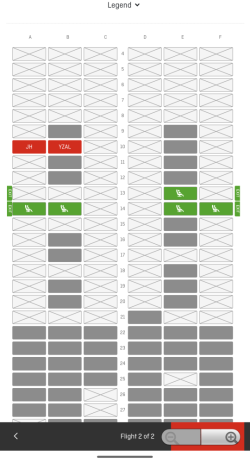
Try seat selection on android and let me know if you guys have the same problem with the confirmation button being stuck behind zoom in/out button.
 
Turn business expenses into Business Class! Process $10,000 through pay.com.au to score 20,000 bonus PayRewards Points and join 30k+ savvy business owners enjoying these benefits:

- Pay suppliers who don’t take Amex
- Max out credit card rewards—even on government payments
- Earn & Transfer PayRewards Points to 8+ top airline & hotel partners

AFF Supporters can remove this and all advertisements

I have the same issue with seat selection, need to zoom in so I have space to click on the "confirm" button without hitting the zoom in/out button.

Had a cancelled SYD-MEL flight and the app let me select an alternative flight very painlessly!
 
Thanks @Captain Halliday for the above screenshot. I had HOPED the app would do something sensible like that so look forward to that for my next flight. That makes sense. However we know it's QF so..... I wasn't sure what to expect :D

re Samsung and the activity statement - yes, I'm on an S20 and have had that same issue through the older versions. It may well be something to do with Sammy's OneUI possibly overriding standard google(Android) behaviour. I'm not sure. It's certainly an interesting data point if it's potentially only certain (or one) brand of Droid having this issue rather than all of them. Annoying, but not end of the world of course. Definitely useful to compare notes in a thread like this though - perhaps QF devs may get wind of it too.

Re seat selection. Mine seems fine (I also noticed a new "use points" toggle - I assume to pay for paid for seats?).

I also just noticed they still offer the "upghrade seat" option for a flight already booked/seated in the highest cabin (eg J on a domestic sector). lol.
 
I figured it out by zooming in then navigating around the zoom button.
1000013992.png
 
The activity statement, after loading more, goes to the oldest one also on my Pixel, running Android 13.

The 'Confirm' button in the seat selection is initially hidden under the zoom controls but I can swipe the view up/down and this way reveal the 'Confirm' button to full view.
 

Become an AFF member!

Join Australian Frequent Flyer (AFF) for free and unlock insider tips, exclusive deals, and global meetups with 65,000+ frequent flyers.

AFF members can also access our Frequent Flyer Training courses, and upgrade to Fast-track your way to expert traveller status and unlock even more exclusive discounts!

AFF forum abbreviations

Wondering about Y, J or any of the other abbreviations used on our forum?

Check out our guide to common AFF acronyms & abbreviations.

Staff online

  • NM
    Enthusiast
Back
Top