New AFF Website

Status
Not open for further replies.
Then there's something wrong with XenForo.

I just loaded the AFF home page and clicked on New Posts and that was 2MB. Most people won't care but some will care as they will be constrained by data usage.
What browser are you using on your mobile device? Chrome has a data saver option. This might be worth looking into
 
Read our AFF credit card guides and start earning more points now.

AFF Supporters can remove this and all advertisements

I did try a couple first :). I think that's the XenForo default which you can currently switch to if you want.

When I tried the XenForo default the quoted text was shaded in a different colour to the ski forum and the contrast didn't work well. I have trouble with italic font, however, so far, the ski forum style is the easiest for me to read out of the 3 options I have seen. The quoted text is darker than the AFF look and stands out well for me. I can adjust to the italic font better on the ski forum than I can to the current AFF format.
 
When I tried the XenForo default the quoted text was shaded in a different colour to the ski forum and the contrast didn't work well. I have trouble with italic font, however, so far, the ski forum style is the easiest for me to read out of the 3 options I have seen. The quoted text is darker than the AFF look and stands out well for me. I can adjust to the italic font better on the ski forum than I can to the current AFF format.

It's not even just the quoted text within threads. I reckon the front page is the best example. AFF the fonts are small and very hard to read (especially the descriptions in the washed out grey underneath) as well as the full list of forums requiring a lot of scrolling. The Ski forum manages to capture all the same in formation in a much easier to read format capturing more forums with less scrolling needed on the front page.
 
I reckon this is a good example of a XenForo forum. Easy to read quoted text.

Ski Forum

And I note the vast different between their first version and the version that is chosen by default, which you can see using their style chooser in the same bottom left location. Wonder how long it took them to get it perfect... I'll bet not in the first week!

Has 50 posts to a page also.

That would require either setting every thread to 50 posts per page, which might upset users on a lower data plan. Or alternatively we would need yet another add-on, which funnily enough would increase page load times. Oh and if we chose to set 50 posts per page as default, all links would break. It's not as simple as it looks.

The Ski forum manages to capture all the same in formation in a much easier to read format capturing more forums with less scrolling needed on the front page.

There were a number of ways to display the data, and that was one of them. Our focus in the migration was to keep the look and feel as similar as possible to the old theme though. Taking on that "blocky" style would have been a radical jump.
 
And I note the vast different between their first version and the version that is chosen by default, which you can see using their style chooser in the same bottom left location. Wonder how long it took them to get it perfect... I'll bet not in the first week!


That would require either setting every thread to 50 posts per page, which might upset users on a lower data plan. Or alternatively we would need yet another add-on, which funnily enough would increase page load times. Oh and if we chose to set 50 posts per page as default, all links would break. It's not as simple as it looks.


There were a number of ways to display the data, and that was one of them. Our focus in the migration was to keep the look and feel as similar as possible to the old theme though. Taking on that "blocky" style would have been a radical jump.

I appreciate the response, and yes these things do take time and use to perfect. But what worries me is it sounds like the approach here may not have been quite right from the start! Sounds like it was an attempt to copy the previous site which seems a bit 'cough about' for a new implementation.

I would have thought the new site should have been viewed from how can we make it the easiest and most efficient for users (potentially providing other XenForum setups for members to vote on/review prior to going down a design path). Could have flagged some of these bugbears before the effort was put in.
 
In regards to the compression of images, we haven just enabled a maximum dimension (width x height) of images, this should mean members are able to upload large photos from their devices, with the forum downsizing them to a more realistic file size.

I guess, please test, but bear in mind users who are on very low mobile data. For this reason, use this thread for testing.
 
I think the attempt to emulate the original site is because of branding and a lot of long term members are happy with that look. Even so there are still lots of comments that they liked the old site 'look and feel'. A no win situation.
 
I appreciate the response, and yes these things do take time and use to perfect. But what worries me is it sounds like the approach here may not have been quite right from the start! Sounds like it was an attempt to copy the previous site which seems a bit 'cough about' for a new implementation.

Our primary goal was to make it as easy to pick up and start using again as possible for our members. There were always going to be differences that we couldn't change, such as PM's becoming Conversations. However, we have had a look and feel for a while that works for us, and this wasn't about a rebrand, but a continuation of that.

The general layout of the forums and the info displayed besides posts we wanted to keep as similar as possible. If we had chosen to go down a completely different path it may have been an even bigger shock for some members of our community. This may be something that is explored in the future.

A lot of the theme elements actually came from the actual homepage.

I would have thought the new site should have been viewed from how can we make it the easiest and most efficient for users (potentially providing other XenForum setups for members to vote on/review prior to going down a design path). Could have flagged some of these bugbears before the effort was put in.

But then it wouldn't have been a surprise.

More seriously, the time frame was not set in stone and this was a very big upgrade. Going through that process would have added cost and complexity to something that was already both of those things.
 
Can anyone recommend a free IPhone app that will reduce/compress/resize a photo and then allow it to be saved on the device, so they can be uploaded here?
 
I just tried again to upload from my iPhone7 to the wine thread some pics I took yesterday. Tagged seven pics, chose 'full size'. Some uploaded (slowly), others were rejected as too large.
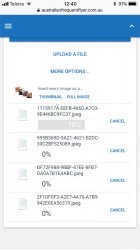
OK, so I cancel those uploads, back out and re-choose thumbnails and hit upload. The uploads would only happen as full size. It seems that once full size is chosen, it locks into that mode. Maybe I have to log out and back in again to reset that?

Another thing. I tried to cancel the whole post but there no longer appears to be an option to do so, which I find very strange. Am I missing something, Sam?
 
The site also has great contrast (text better defined and not washed out) and a lot less wasted space than there is here now

Spacing is actually similar on short posts.

The key differences are.
* Default font for posts is slightly larger and full black rather dark grey. (The larger font helps hide the user banner on smaller posts)
* Quotes are shown in a shaded block in full black, versus a medium grey
* Slight less info/ smaller spacing in the avatar column

On style points, I don't mind the grey background for the quotes - the existing AFF already has a grey background for signatures and a black for votes (and I think yet another grey for the avatar column)
 
Another thing. I tried to cancel the whole post but there no longer appears to be an option to do so, which I find very strange. Am I missing something, Sam?

Also struck that issue. Although every word I write is a gem, I recognise sometimes they are more coal than diamond so would like to be able to cancel the whole thing before posting.
 
I just tried again to upload from my iPhone7 to the wine thread some pics I took yesterday. Tagged seven pics, chose 'full size'. Some uploaded (slowly), others were rejected as too large.

When you have tagged your 7 images I presume you see a screen somewhat similar to the below? And at that stage you choose "full size"? You're not meant to select "thumbnail" or "full size" until the images have finished uploading, and they will upload one by one with a percentage bar indicating progress. However, I am seeing the same issue as you with regards to uploads and I am devoting all my time to it right now.

IMG_B7AA381B4F1B-1.jpeg

Another thing. I tried to cancel the whole post but there no longer appears to be an option to do so, which I find very strange. Am I missing something, Sam?

Also struck that issue. Although every word I write is a gem, I recognise sometimes they are more coal than diamond so would like to be able to cancel the whole thing before posting.

As you type you will have no doubt noticed that drafts are saved. This helps you move away from a post and come back to it later to find it all still saved. Of course, without a cancel button, if you leave the post and come back to the thread to reply again later, it may all be waiting for you when you get there.

I have limited testing of this functionality, but if you delete your post (select-all + backspace) and then navigate to the button in the text editor that looks like a "black page with its corner folded over and a circular arrow going backwards" you can choose the option to save or delete draft, essentially clearing the reply box. Sure, it's not perfect, but I haven't seen a cancel button in a while. Drafts do expire over time too.

Screen Shot 2017-09-14 at 12.19.17 pm.png
 
Status
Not open for further replies.

Become an AFF member!

Join Australian Frequent Flyer (AFF) for free and unlock insider tips, exclusive deals, and global meetups with 65,000+ frequent flyers.

AFF members can also access our Frequent Flyer Training courses, and upgrade to Fast-track your way to expert traveller status and unlock even more exclusive discounts!

AFF forum abbreviations

Wondering about Y, J or any of the other abbreviations used on our forum?

Check out our guide to common AFF acronyms & abbreviations.
Back
Top