New AFF Website

Status
Not open for further replies.
I'm sure the backend needed the updates to take AFF into the future and as a result it feels like a step backward.

Personally, I used only the app. Now that the app is gone, I don't see my time on AFF being anywhere near what it used to be. The mobile site, while not bad, is not an app replacement. Given that mobile app traffic is HUGE in the travel sector, one could assume that AFF app traffic represents the most active users. Especially as you need a paid membership to use the app.

I hope that an updated app is on the immediate future roadmap for AFF and Im looking forward to what new improvements can be made with the updated forum platform!:)
 
it wasn't broke it just needed a modern update
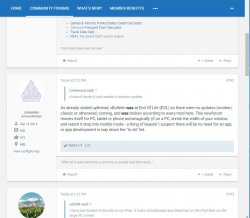
As already stated upthread, vBulletin was at End Of Life (EOL) so there were no updates (modern, classic or otherwise) coming, and was broken according to every mod here. This newforum resizes itself for PC, tablet or phone automagically (if on a PC, shrink the width of your window and watch it drop into mobile mode - a thing of beauty! I suspect there will be no need for an app, or app development is way down the "to do" list.
 
I have just looked at the site on my iPad. It looks considerably less bleached on the iPad than on the large PC screen.

I guess it's the way of the world that mobile devices dominate the design of sites.

I imagine it also accounts for the seemingly excessive white space. Room needs to be left around buttons and links for finger-tapping.

I do the vast majority of my AFF stuff on my PC with a large screen, on which the new version does look less than optimal IMO. But I suppose I'm in a minority in that regard.

I'm not sure that PC users are in the minority or not, but certainly they are the most important and therefore should be looked after! :p
 
OK in my attempt to become the non-headless forum member, I have uploaded my jpg file in reduced size (down to 52x96 pixels) and it still apparently removes the head. Suggestions?

Without wandering?

Fred
 
OK in my attempt to become the non-headless forum member, I have uploaded my jpg file in reduced size (down to 52x96 pixels) and it still apparently removes the head. Suggestions?

Without wandering?

Fred
The image can be 200 by 200 pixels but you need to have a lot of white space around your image.
 
OK in my attempt to become the non-headless forum member, I have uploaded my jpg file in reduced size (down to 52x96 pixels) and it still apparently removes the head. Suggestions?

Without wandering?

Fred

Instead of using the old reduced-pixel image, I was now able to use the original full-size photograph. Maybe not quite the same thing as your comic image, but I guess what I'm saying is size no longer seems to be the limitation that it was.
 
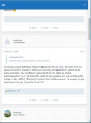
This newforum resizes itself for PC, tablet or phone automagically (if on a PC, shrink the width of your window and watch it drop into mobile mode - a thing of beauty!

I don't see a great difference:

Wider has member info down the side.

Narrower has member info at the top and subsidiary information (eg. signature, flight path link) disappears. Still looks bleached.

AFF PC mode.JPG AFF mobile mode.JPG AFF mobile mode.JPG
 
Apart from New posts in threads going back to August how can you tell if you've already posted in a thread as opposed to not posting in a thread? All threads look the same to me.

Also profile information when viewing is very limited.

If this software is the future then something went horribly wrong with the design.
 
The image can be 200 by 200 pixels but you need to have a lot of white space around your image.
Aaargh.... Warning: if you select custom avatar to try something out, it's irreversible (ie Close or Esc does NOT back out with avatar unchanged - b#gg#r!).

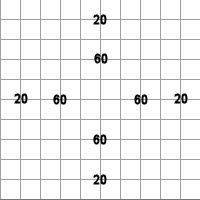
Anyway, here's a guide: this is a 200x200 pixel square with gridlines at 20 pixels:

grid_20.jpg

This is how the forum software cuts the image into a circle: it looks as if it cuts a circle that's 10 pixels in from the edge:

custom_avatar.jpg

Hope this helps.
(I'm stuck with thisa avatar till I'm next at work to replace my avatar with my old Flight Deck one)
 
Last edited:
One word says it all 'BLEACHED".

Except, you haven't used one word.

I understand you think we have taken a step backwards and the design does not fit with what you would like. However, we will not be going back to the previous website at this period.

I wonder whether it would be possible to create an Issues list of things that are still being worked on. @Admin @samh004
I would have suggest a Wiki attached to this thread, but that in itself is seemingly currently problematic.

On the whitespace issues I dont really see the problem, but some (hopefully simple solutions) would be:
* Delete some of the 4 lines below avatar in full screen view (# posts is the only one I'd keep, date joined, thumbs and location less relevant)
* Combine the Report/Quote/Reply bar with the Voting Bar

While I think that's got some merit, even organising the list right now would be a distraction to me :p

As for the last point you made about the report/quote/reply bar... on your screen you see 4 buttons, but on mine I see many more, as I have extra actions that I can perform on posts. I don't think the add-on for post ratings allows them to be integrated into this bar, but had it, it would have created problems for me in viewing the site.

I imagine it also accounts for the seemingly excessive white space.

Regarding the white space issue, if anyone has an old screenshot of AFF in the vBulletin days you will notice that it previously had a more inefficient misuse of space.

Previously, your user information was to the left and post to the right, as with now. However your signature would not start until all the information in the left section was finished displaying, often causing a huge waste between a one-line post and a signature if the member also had a lot of user information, some QF/VA Verified Status showing and had used the Flight Tracker.

Flash forward to the new design and not only does a signature start immediately after a post, sometimes ending up adjacent to the number of posts made on the left is a user profile, but we also have removed a lot of the user information that used to display on the left, such as the Verified Status and extra details from the Flight Tracker.

I'm not singling you out @JohnM but the fact remains, there is actually less whitespace in forum posts than there was before.

There is no innovation to this update period, it wasn't broke it just needed a modern update but this has gone backward, its now bland, faint and plain ugly, a real shame. Signatures of SN members are in top banner and allowed for commercial customers at bottom after text posting.

When I read something like this my urge is to quip back with something sarcastic. This is from my bad wit. The thing is though, it's not constructive, and neither is posting more or less the same message over and over again in this thread about how much you don't like the design. I understand you don't, but we will not be reversing course.

A lot has changed, and a lot has been improved. Now whether it looks good is of course subjective, but elements have been carefully considered and the layout chosen to take AFF into the future while also not being too big a step from the past. This is why the forum structure has not changed. The previous vBulletin "skin" was not heavily adapted from the default look, but this has been, to create a flow from the front page (www.australianfrequentflyer.com.au) to the community forums. You will find a similar colour scheme.

The mobile site, while not bad, is not an app replacement. Given that mobile app traffic is HUGE in the travel sector, one could assume that AFF app traffic represents the most active users. Especially as you need a paid membership to use the app.

That's true, an app generally drives engagement. However here's my counter, due to the state the app has been in lately, it has probably kept people away. The new site works so well on a mobile web browser compared to that app that it may provide a boost to traffic. Further, free members would previously have had no choice but to use the very intuitive mobile skin of vBulletin to browse and this may have turned them off visiting and posting, but with this new responsive design, they may be encouraged to become more engaged. Obviously, the numbers speak louder than words and it has only been about 36 hours, but it would be something I look at soon!

I suspect there will be no need for an app, or app development is way down the "to do" list.

That is an interesting theory. For now the official word is that an app will be coming soon, however you are partially right that it is further down the "to do" list.
 
Apart from New posts in threads going back to August how can you tell if you've already posted in a thread as opposed to not posting in a thread? All threads look the same to me.

Also profile information when viewing is very limited.

If this software is the future then something went horribly wrong with the design.

The August thing sorts itself out when you've poked around a little.

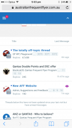
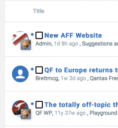
For threads you've posted in - this is cute. Your avatar appears in relevant threads as per below.

And this works waaay better than the app that is currently in the App Store.

IMG_1442.PNG

I think everyone should cut some slack here. I've seen website update that go completely haywire. This went really well. Yesterday was the first time I'd seen it and I already see huge improvement. Other than my fat fingers. I've tried it on iPhone IPad and PC and think it's great. Of course there are some things to sort and it's basically fixed the app issue so it's a great way forward. Just my 2 cents.
 
Last edited:
I don't see a great difference:
The old vBulletin would either scroll off the page or shrink the fonts so small you couldn't read them. The newer software (which Google wants on all websites if you want to be near the top) has to be mobile-friendly which means the website automatically switches into mobile mode below a certain width (hence the horizontal menu disappears and is replaced by the standard and universal "hamburger" three horizontal lines menu. I'm currently having my websites rewritten to conform to mobile mode, and yes, there's more white space due to fat fingers and touch screens.

"It is what it is".

I find this site quite readable and its functionality is similar to most other fora I visit: if I had my "druthers", I'd rather the font be blacker than grey, but otherwise it doesn't bother me too much. I guess witrh time, there will be (more) themes from which we users will be able to select.

For the time being, the sysadmins have got the site up and running with minimal disruption - an excellent achievement I have to say.
 
Apart from New posts in threads going back to August how can you tell if you've already posted in a thread as opposed to not posting in a thread? All threads look the same to me.

I'm not the first to show you this, but if you have participated then your avatar appears inset the thread starters avatar.

Screen Shot 2017-09-10 at 5.39.39 pm.png

(I'm stuck with thisa avatar till I'm next at work to replace my avatar with my old Flight Deck one)

I know it's small, but this was cached to my page as I hadn't reloaded the window.

55197.jpg

And this works waaay better than the app that is currently in the App Store.

I think we may be in the minority on that point, but even though I'm biased, I have found myself more engaged on my mobile and haven't had to run to a computer nearly as many times as I had to previously, today.
 
I'd rather the font be blacker than grey, <snip> .

This is a huge issue for me on many sites. I can easily read black text, grey especially very light grey text is nigh on impossible.

Did you get a choice when setting up the site or just a default text colour?
 
Thank you, samh004, avatar uploaded. Likewise, I've used my mobile more today until just now to do the avatar thing.
 
Read our AFF credit card guides and start earning more points now.

AFF Supporters can remove this and all advertisements

Status
Not open for further replies.

Become an AFF member!

Join Australian Frequent Flyer (AFF) for free and unlock insider tips, exclusive deals, and global meetups with 65,000+ frequent flyers.

AFF members can also access our Frequent Flyer Training courses, and upgrade to Fast-track your way to expert traveller status and unlock even more exclusive discounts!

AFF forum abbreviations

Wondering about Y, J or any of the other abbreviations used on our forum?

Check out our guide to common AFF acronyms & abbreviations.
Back
Top